Client: IPB Insurance
Projects: Stakeholder & Annual Report 2013
Turn-around: 5 weeks (192 pages)
Projects: Stakeholder & Annual Report 2013
Turn-around: 5 weeks (192 pages)
IPB Insurance, the only wholly Irish-owned
general insurance company in Ireland, has
garnered a much coveted reputation for
trailblazing in its industry. It was the first
company in the world to introduce a formal
dividend reporting process for a nonshareholder
dividend – in other words, a social
dividend allocated to the citizens of Ireland.
This ‘industry first’ demanded a rethinking
of the conventional Annual Report format.
IPB approached us to help them achieve the
goal of creating a combined annual report
and stakeholder/sustainability report in one
reporting document – the first of its kind in
Ireland.
Our brief was to ensure that we
communicated the inherent warmth and
earthiness of IPB’s personality, while also
delivering a creative concept that captured
the uniqueness of the report – the first of its
kind in the Irish market. The design direction
had to strike just the right balance, reflecting
the company’s mutual ethos: “Prudent yet
innovative”.
The CMO of IPB is a genuine believer in
the power of design to bolster competitive
advantage. We embraced this and rose to the
challenge of designing a report that clearly
communicated the brand’s point of difference,
while relishing the freedom that our client
It was vital that we gained a deep
understanding of the overarching corporate
strategy and, working closely with our client,
we developed a report that would become an
intrinsic part of its communications strategy.
This strategy is built around “the power of
three”. This consistent theme of threes is part
of the brand’s DNA. Three key elements inform
the company’s planning and performance measurement at corporate and individual level,
forming the foundation and the very essence
of the IPB brand and ethos. The report is the
cornerstone of IPB’s corporate objective,
acting as a visual representation of the
company’s key point of difference, reflecting
the overriding strategic ambition of brand.
We really wanted to create something distinct
and special that reflected the unique nature
of the task at hand, yet embraced the warmth
and friendliness of the brand’s personality. We
took a tactile, multi-sensory approach with
the design direction, which was also reflected
in the natural FSC and PEFC certified stocks
of Munken Lynx and uncoated FSC certified
UPM Fine, giving the report a sophisticated,
confident, yet friendly look and feel.
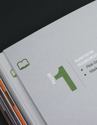
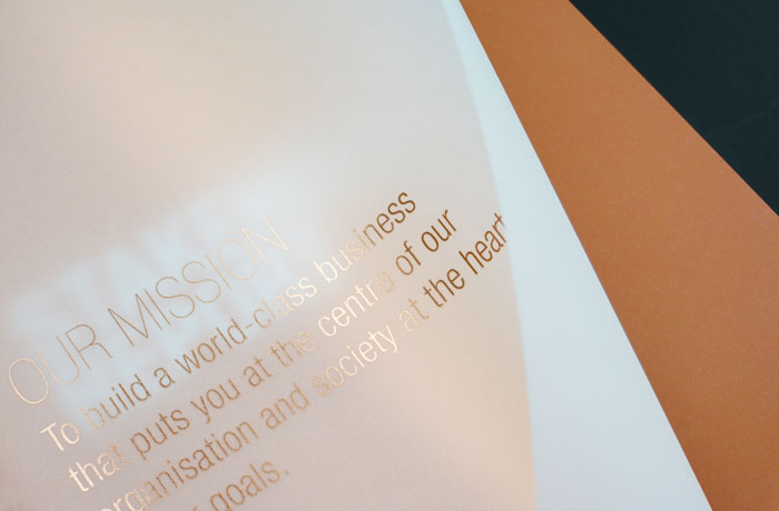
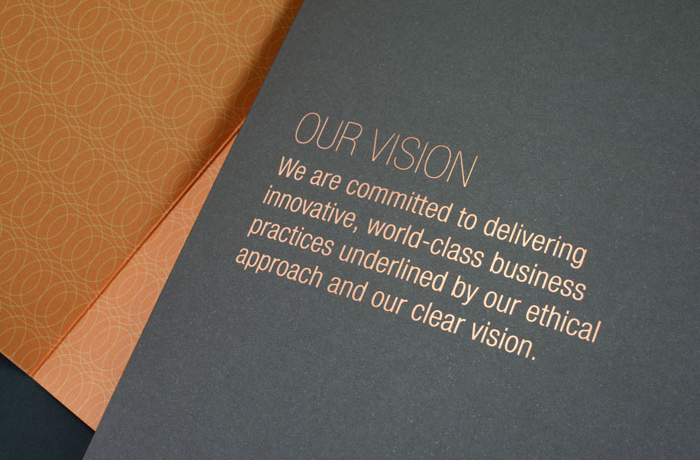
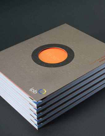
We used a rich copper foil on the cover. This
bold, elemental colour is carried through the
inside pages, through the use of copper ink,
anchored with a subtle earthy colour palette
and the use of translucent paper that gives the
report a softer feel. The circle graphic of the
brandmark is used as a key graphic element to
reinforce the brand, through a subtle repeating
pattern, and also as a device to highlight key
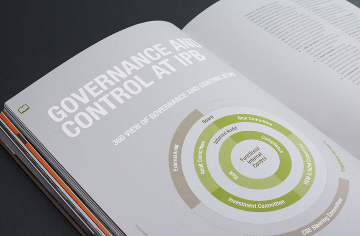
information. We used a clever, yet functional
die cut on the right hand corner of the report
to speed up navigation and create a much
more user-friendly format.
Client feedback has been extremely positive.
The creative concept has achieved the cutthrough
that was demanded from the brief.
But equally importantly was the reaction of
the shareholder members and employees.
Feedback has been extremely positive,
bolstering brand awareness and a deeper
engagement with the brand. We’re proud to
say that the report was awarded Annual Report
of the Year at the annual Irish Print Awards.
